The Invisible Labor: What Clients Are Actually Paying For When the Work Looks Effortless
There is a particular kind of client feedback that experienced creative directors have learned to interpret with great care. It arrives after weeks of research, dozens of rejected directions, and countless hours of refinement. It sounds, on the surface, like a compliment: "It looks so clean. So simple. I just wonder if we're paying for something we could have done in-house."
The question is understandable. It is also, from a craft perspective, almost entirely the wrong one.
The studios producing the most enduring commercial and artistic work in the United States today are not charging premium rates because their output is complicated. They are charging premium rates because achieving genuine simplicity — the kind that communicates instantly, ages gracefully, and operates effectively across every context — is among the most technically and intellectually demanding undertakings in visual communication.
The Paradox at the Center of Premium Design
Minimalism, as a visual philosophy, has never been more commercially prevalent. From direct-to-consumer packaging to corporate identity systems to editorial photography, the American visual landscape is saturated with work that aspires to restraint. The problem is that most of it fails quietly. It does not fail by looking busy or confused. It fails by looking inert — technically sparse but strategically hollow.
The difference between inert minimalism and purposeful simplicity is almost impossible to articulate in a brief or a mood board. It is, however, immediately perceptible to an audience. One version of a minimal logo feels inevitable, as though no other solution could have existed. Another version of the same minimal logo feels merely incomplete. The distance between those two outcomes is not a matter of taste. It is a matter of process.
Premium studios understand this distinction and price accordingly. The craft tax — the premium attached to work that appears deceptively simple — reflects not the reduction of elements on the page, but the expansion of the decision-making required to arrive at that reduction.
What the Invoice Does Not Itemize
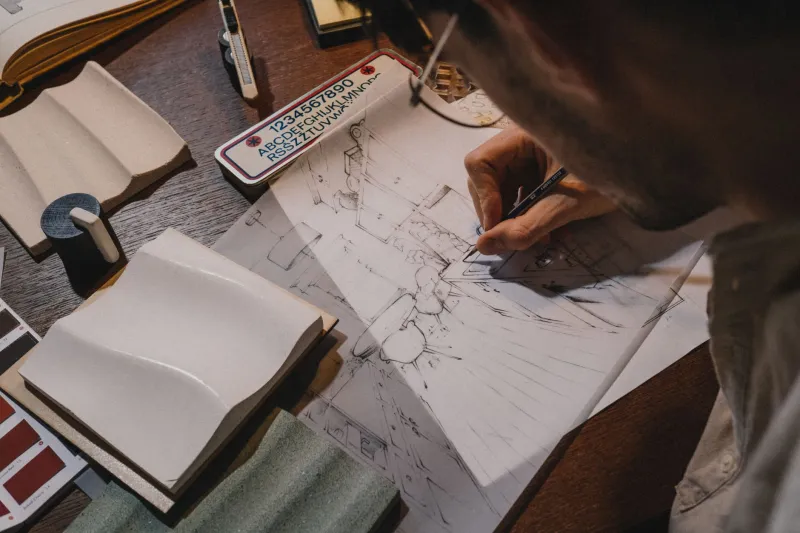
When a studio delivers a refined visual identity or a restrained campaign image, the deliverable itself rarely communicates the scope of what preceded it. Consider what a single, confident typographic choice actually represents: an audit of hundreds of typeface options against the client's industry, competitive landscape, cultural associations, and intended audience demographics. A review of how each candidate performs at small sizes, on digital screens, in print, and in environmental applications. A series of stress tests against foreseeable future contexts — acquisitions, international expansion, product line extensions.
None of that labor appears in the final file. It is, by design, invisible. But its absence from the deliverable does not make it absent from the work. The confidence of that typographic choice — its durability, its appropriateness, its resistance to looking dated within eighteen months — is a direct product of the invisible labor that preceded it.
The same principle applies to photography. A single hero image that reads as effortless — clean, luminous, emotionally precise — may represent an entire day of pre-production conversations about what the image must not say, followed by a shoot structured around eliminating every visual element that would distract from a single intended response. The image looks simple because everything complicated has been removed. Removing it required expertise.
Educating Clients Without Condescending to Them
The studios that navigate this challenge most effectively have developed what might be called a transparency strategy: a deliberate, ongoing effort to make the invisible labor visible without undermining the sense of creative authority that clients are also paying for.
This does not mean presenting clients with exhaustive documentation of every rejected direction. It means creating moments — during the engagement, not just at the final presentation — where the depth of the process becomes apparent. A mid-project working session that walks a client through the strategic criteria used to eliminate options is more persuasive than any invoice footnote. A brief written case study shared after project completion, explaining the three most consequential decisions made during the engagement, builds the kind of institutional understanding that makes the next conversation about pricing considerably easier.
Forward-thinking studios also frame simplicity as a competitive asset, not merely an aesthetic preference. In a visual environment where the average American encounters thousands of brand impressions daily, the work that communicates most efficiently holds the greatest strategic value. Achieving that efficiency requires the elimination of everything that does not serve the communication — and that elimination is not passive. It is one of the most active, rigorous, and time-intensive phases of the creative process.
The Cost of Getting Simple Wrong
There is a practical argument for the craft tax that transcends philosophy. Work that achieves apparent simplicity through genuine strategic rigor tends to perform differently over time than work that achieves apparent simplicity through mere reduction.
A brand identity that looks clean because it has been carefully considered will continue to look considered as it encounters contexts its creators could not fully anticipate. A brand identity that looks clean because someone removed elements without a clear strategic rationale will begin to reveal its fragility the moment it is applied at scale, or in an unexpected environment, or alongside a competitor who has invested more deliberately in their own visual language.
The cost of getting simple wrong is not felt immediately. It accumulates. It appears in the form of inconsistent applications, brand extensions that feel off, and eventually, a reinvestment in the identity work that should have been done correctly the first time. Premium studios are not simply charging more for the same output. They are charging for a different category of outcome — one whose value compounds rather than depreciates.
The Studio's Responsibility
None of this means that every client who questions premium pricing for minimal work is wrong to ask. The question itself is reasonable. The responsibility falls on the studio to have developed a coherent, articulate answer — not a defensive one.
The most effective studios treat the pricing conversation as an extension of the creative work itself: an opportunity to demonstrate the same clarity of thinking, the same confidence in strategic reasoning, and the same respect for the client's intelligence that characterizes their best visual output. If a studio cannot explain, in plain terms, why restrained work costs more, it may not fully understand why restrained work costs more.
The craft tax is not a surcharge for aesthetics. It is the accumulated cost of every decision made in service of an outcome that appears, to the untrained eye, as though no decision was required at all. That appearance is not incidental. It is the deliverable.