Touch Points: Why the Most Forward-Thinking Studios Are Designing for Hands, Not Screens
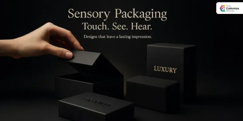
Photo: luxury packaging design print production studio tactile materials, via thecustomizeboxes.com
The scroll does not stop for beauty. It does not pause for craftsmanship, linger over typographic refinement, or register the weight of a paper stock. The digital feed is a relentless, indifferent medium, and it has conditioned audiences and clients alike to treat visual communication as inherently disposable—something to be consumed in fractions of a second and immediately replaced by the next frame.
Against this backdrop, a significant and accelerating counter-movement is underway in American creative studios. The most innovative practitioners are not chasing the algorithm. They are deliberately, strategically moving away from it—toward print, packaging, environmental graphics, and physical space as their primary expressive canvas. And the commercial demand driving this shift is not nostalgic. It is intensely contemporary.
The Limits of the Luminous Rectangle
Every digital surface shares a fundamental constraint: it is a rectangle emitting light. The variations within that constraint—resolution, color gamut, aspect ratio—are meaningful to designers but largely invisible to audiences. What audiences do perceive, with increasing acuity, is sameness. The visual homogeneity of the digital environment has become so pronounced that differentiation within it requires ever-greater effort for diminishing returns.
Physical design operates under an entirely different set of constraints—and those constraints are generative rather than limiting. A luxury candle box must survive shipping, open satisfyingly, and communicate brand values in the moment of unboxing. An environmental graphic must function at distances from six inches to sixty feet, in variable lighting conditions, for audiences moving at different speeds. A wine label must be legible when wet, attractive when backlit, and tactilely compelling when held. None of these requirements can be solved with a hex code.
The complexity is the point. Physical design demands a more rigorous, more interdisciplinary form of problem-solving—and the results, when executed with genuine mastery, achieve something no screen-based asset can replicate: they become objects people form relationships with.
Materiality as Brand Language
Psychological research has long supported what experienced designers understand intuitively: physical properties communicate meaning independently of visual content. The weight of a business card conveys financial stability. The texture of a book cover signals intellectual seriousness or approachable warmth. The resistance of a package as it opens creates anticipation that directly influences how the product inside is perceived.
This is not superficial. It is the fundamental psychology of materiality—the way physical experience shapes cognitive and emotional response. Brands that understand this principle treat material selection not as a production decision but as a strategic one. The substrate, the finish, the structural form, the tactile detail: each is a communication channel operating in parallel with the visual.
Leading US studios working in luxury categories—spirits, cosmetics, fashion, hospitality—have become particularly sophisticated in deploying this understanding. Soft-touch lamination is chosen not because it is fashionable but because it signals approachability within a premium context. Uncoated stocks in natural tones communicate authenticity and environmental consciousness without a single word of copy. Embossing and debossing create shadow and dimension that shift with viewing angle, producing a visual dynamism that digital reproduction cannot capture—which, for certain brands, is precisely the objective.
The Reproduction Barrier as Competitive Advantage
There is a concept gaining currency in high-end studio circles that might be called the reproduction barrier: the deliberate design of physical work that cannot be adequately conveyed through a photograph or screen capture. This is not a technical limitation to be overcome. It is a strategic asset to be cultivated.
A package that must be held to be fully understood creates an experiential exclusivity. It rewards purchase and penalizes passive browsing. In a market where digital content is infinitely replicable and freely distributed, an object that resists digital translation possesses genuine scarcity value. The consumer who encounters it in-store, at an event, or through a physical mailer receives something that no amount of online research could have fully prepared them for.
Some studios are extending this principle into environmental design—creating spatial experiences specifically calibrated to resist photographic documentation. This is a provocative inversion of the Instagram-era imperative, which demanded that physical spaces be designed primarily as backdrops for content creation. The emerging counter-position holds that spaces designed for documentation have been optimized for the wrong audience.
Print's Unlikely Renaissance
The print industry's decline has been extensively documented, but the more nuanced story—the one unfolding in premium creative studios—is considerably more interesting. While commodity print has contracted, high-craft print has expanded. Annual reports produced as collectible objects. Direct mail designed with the production values of art books. Promotional materials that function as artifacts.
This is not a volume business. It is a value business. And it is attracting significant investment from brands that have recognized a counterintuitive truth: in an environment where digital communication is free and ubiquitous, a well-produced physical piece is one of the most powerful signals of seriousness and investment that a brand can send.
The studios positioned to capture this demand are those that have retained or rebuilt expertise in print production—an understanding of press capabilities, paper engineering, finishing techniques, and the relationship between design intent and production reality. This knowledge, once considered foundational, had become uncommon enough that its possession now constitutes genuine market differentiation.
Designing in Three Dimensions
Environmental graphics and spatial design represent perhaps the most demanding frontier of this physical renaissance. Designing for three-dimensional space requires an understanding of human movement, perceptual psychology, lighting behavior, and material durability that extends well beyond the competencies of traditional graphic design practice.
Studios that have developed genuine spatial design capability—the ability to concept, specify, and oversee the installation of work in physical environments—are finding robust demand from retail, hospitality, corporate, and cultural clients. The flagship store, the branded office, the museum installation: these are contexts in which visual communication is inseparable from architectural experience, and they require a practitioner who can operate fluently across both domains.
The Screen Will Always Be There
None of this is an argument against digital design. The screen is not going away, and the studios thriving in the physical space are, in most cases, equally sophisticated in digital practice. The point is not replacement but rebalancing—a recognition that the most complete and compelling brand experiences are those that engage audiences across multiple sensory registers, including the ones that no algorithm will ever be able to optimize.
The physical world remains the most powerful creative medium available. It always has been. The studios that remember this—and build their practice around it—are producing some of the most enduring work of the current era.

